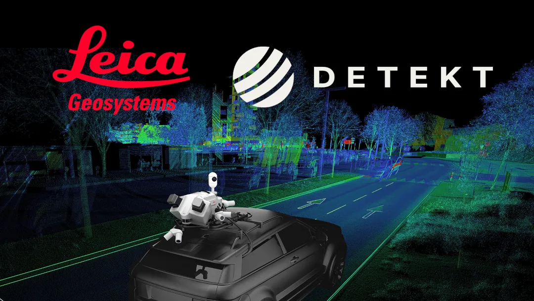
A fresh look at Detekt
Embarking on our journey in 2020, detekt initially honed in on the meticulous analysis of road conditions, traffic signage, and asset management. Our path has since taken a dynamic turn, transforming us into a versatile mobile mapping platform.
Fast forward to 2024, "Detekt" stands as a hardware-independent geodata platform, embraced by a diverse array of global users, empowering them with actionable insights. Alongside our technological growth, our brand too has matured. We recognized the need for a fresh identity—one that encapsulates our sophisticated approach to data analysis and mirrors our growth trajectory.
Our rebranding is more than a mere facelift; it's a declaration of our ongoing dedication to excellence, particularly within the public sector. We've evolved not just to keep pace with the future but to represent the enduring principles of trust and dependability that our clients have come to rely on.

Font
Inter stands as the backbone of our brand's visual communication. Its clean, sans-serif lines convey clarity and precision, mirroring the analytical prowess of our AI-driven geo data analysis. Trustworthy and ubiquitous, Inter is the silent workhorse that speaks volumes.

Color
Our palette is a harmonious blend of tradition and innovation. Dark navy blue and violet anchor our brand in a legacy of trust, while foggy white and tech grey provide a canvas for clarity. Accents of turquoise and ocean blue inject a dynamic, forward-thinking spirit.

Icons
Utilizing Google's font icon library ensures our brand's visuals are instantly familiar and accessible. This strategic choice aligns with our commitment to reliability and professionalism, while allowing the flexibility to adapt and expand our visual language.


.svg)
